Title:
Overview
As part of a case study, new usability features and changes are proposed in an interactive Figma prototype for the application X (formerly known as Twitter). These changes aim to empower the user in their experience using the platform. The hypothetical new features cover sentiments expressed through primary and secondary research conducted; revealing insights into user concerns regarding AI training, data collection, and feed algorithms.
The final prototype proposes the following changes:
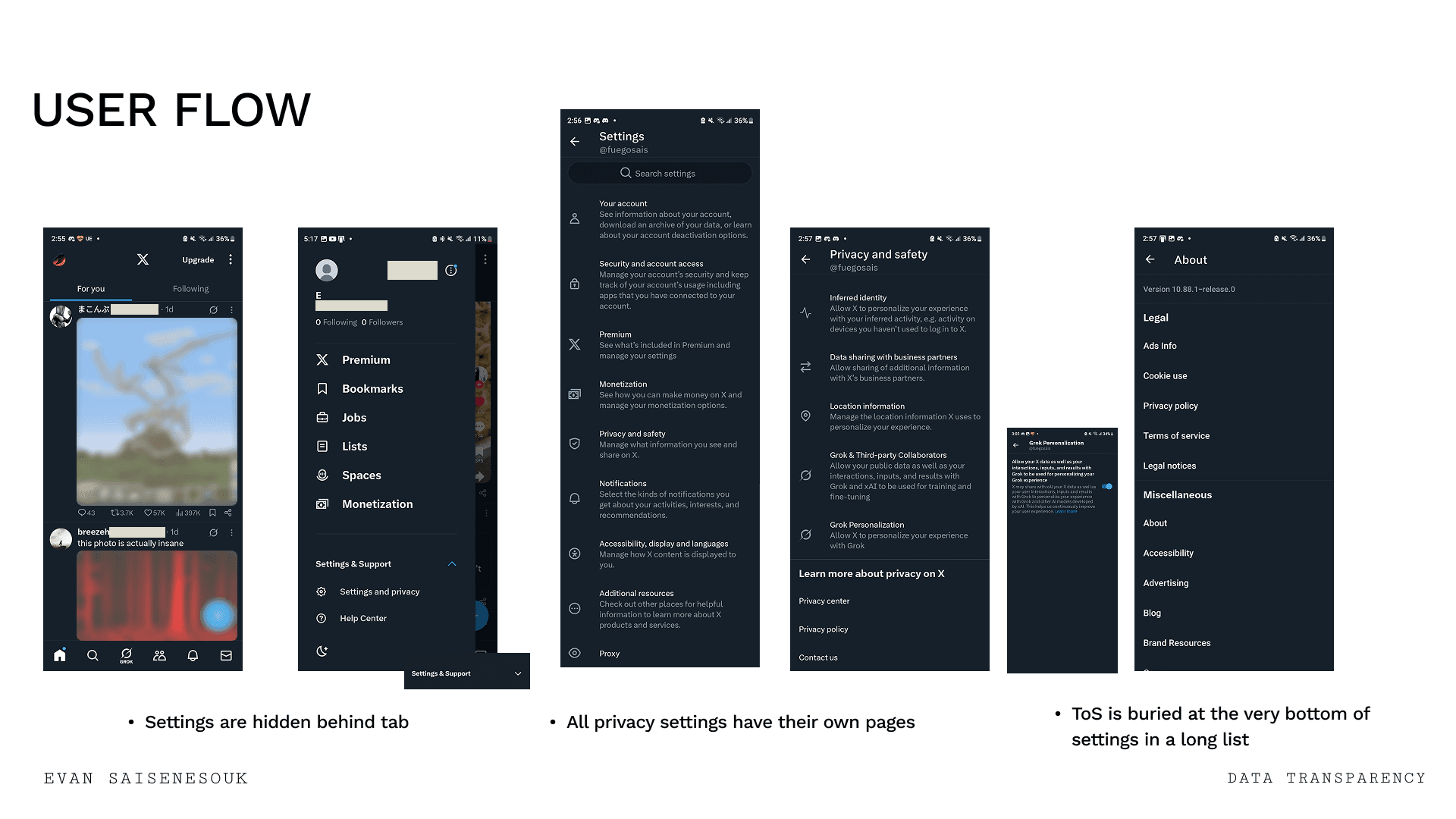
Increased visibility of Privacy/TOS settings so users are more informed and empowered with their data.
Clear TOS and app update notifications to be transparent and clear with users.
Improved feed preference customization and filtering to encourage users to customize their experience.
Adjustments/tweaks:
Added specific context on suggested posts and ads to inform users on why they are receiving certain posts or ads, allowing them to engage or disengage.
Reordering of the side menu to prioritize important user settings first before anything else.
*Please note that this is a Case Study created for conceptual purposes and is not associated with X
Prototypes
Using Figma, three iterations of the new features were developed.
The prototype follows a single User Journey scenario where the user opens the app after the hypothetical patch update and edits their feed to feature Apples instead of Oranges. This effectively shows off each of the changes proposed and was iterated upon after several rounds of User Testing. The experience was designed to empower users and give them the tools to customize their experience transparently and not buried.


Low-Fidelity Wireframes


Mid-Fidelity Wireframes


Research
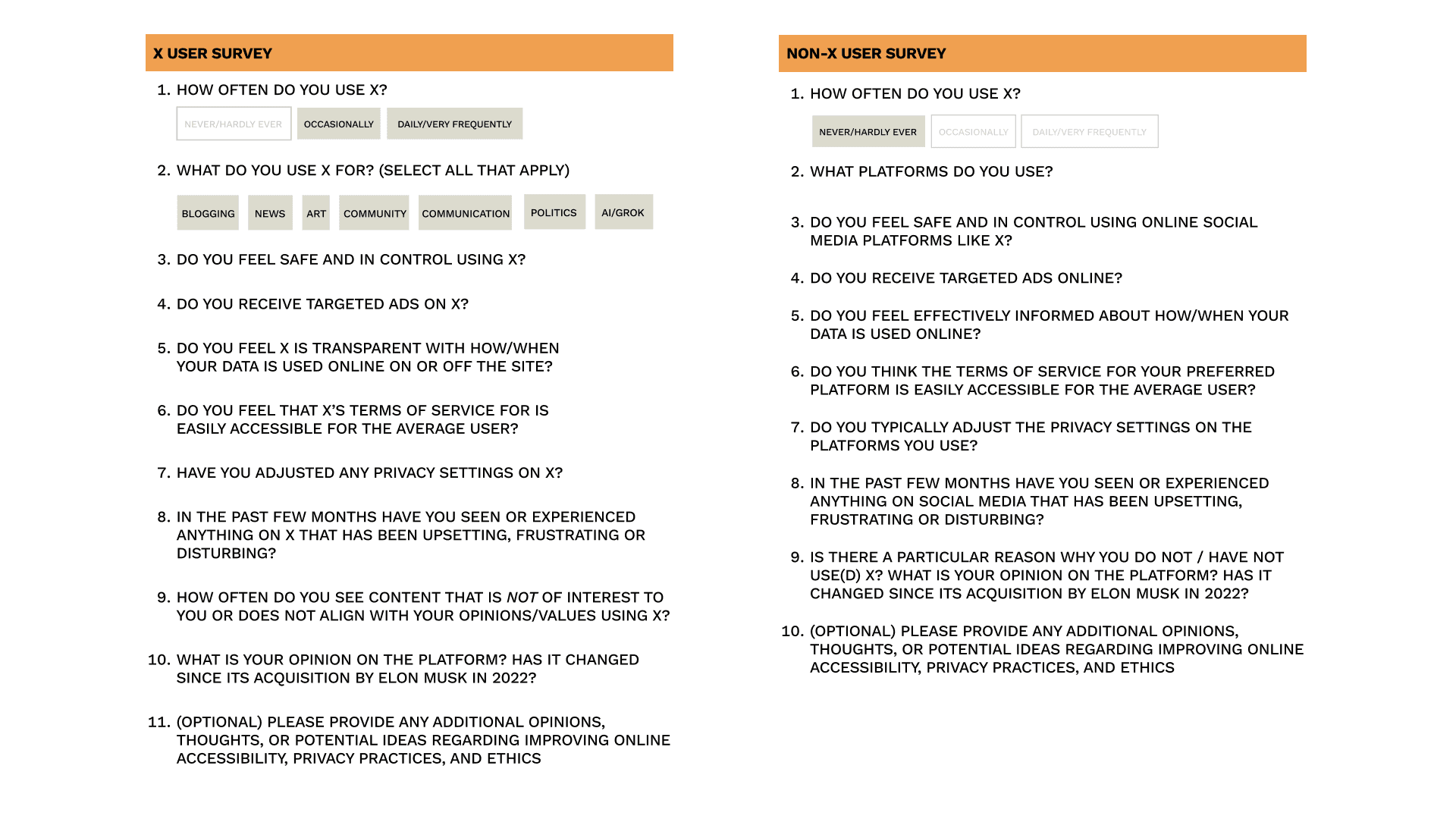
To determine people's views, behaviour, and perspectives regarding the social media platform X, a survey was developed with two streams to gain the opinions of frequent users of X and those who do not use the platform to gain nuanced opinions from both sides. The survey was distributed to fellow students as well as a select group of people online, ranging from ages 18-25 from a variety of backgrounds with their personal info anonymized.
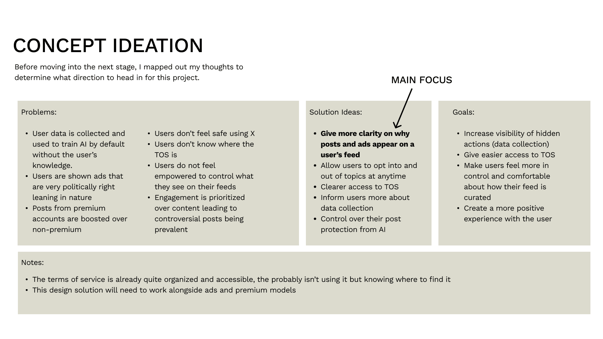
After analyzing the survey data, six key problems were discovered throughout the results. These problems included concerns about AI training of user content, controversial/upsetting feeds pushed by the algorithm, hidden TOS, and more. With these problems, defined, solutions and goals were created to address throughout the project as the through line.
Development
To start I took screenshots of the app and documented the current user flow of completing “problem area” tasks defined by the survey results. Such as finding the TOS, or removing unwanted posts and topics from their feed. I also took some time to look into other similar platforms like Bluesky to get some inspiration. Then, I began production of low fidelity, mid fidelity, and high fidelity interactive prototypes on Figma; testing with a variety of methods and receiving feedback from peers and survey participants.
Testing
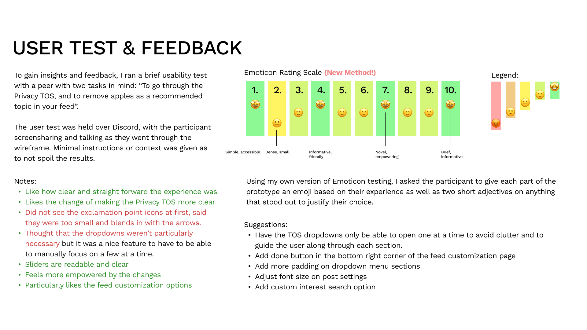
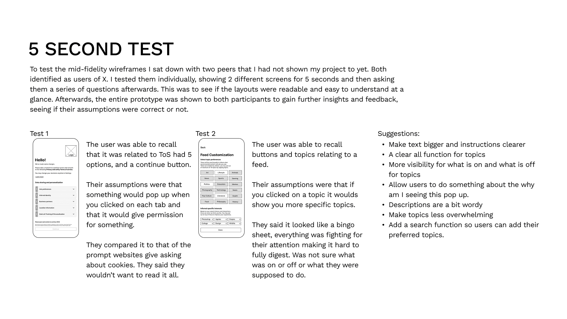
Different user testing methods were practiced when testing the different stages of the prototype (alongside general user testing). These methods include: Five second test and Emoticon scale. These methods helped debug and test usability, feasibility, flow, and clarity allowing me to iterate and improve the design over the course of the four week project in order to deliver a refined project reflective of user wants and needs.
*Participant consent forms were issued in accordance to TCPS2202 Standards.